// AI Surveillance Platform
UX Case StudyAutonomous Surveillance Dashboard Redesign
Streamlining a high-stakes enterprise security platform to cut incident response time, reduce configuration errors, and unify a light/dark multi-modal interaction system.
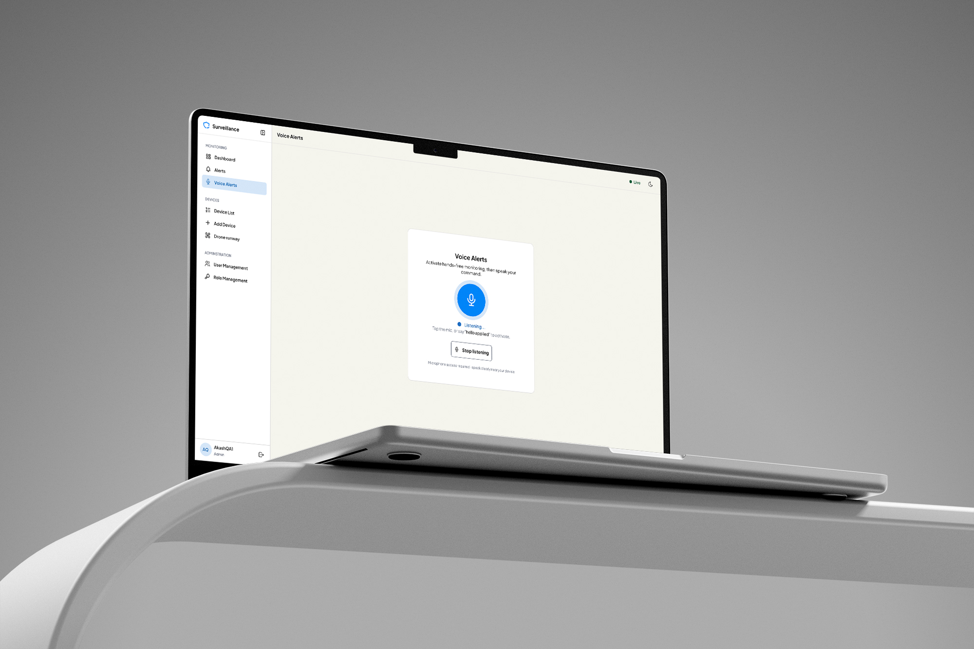
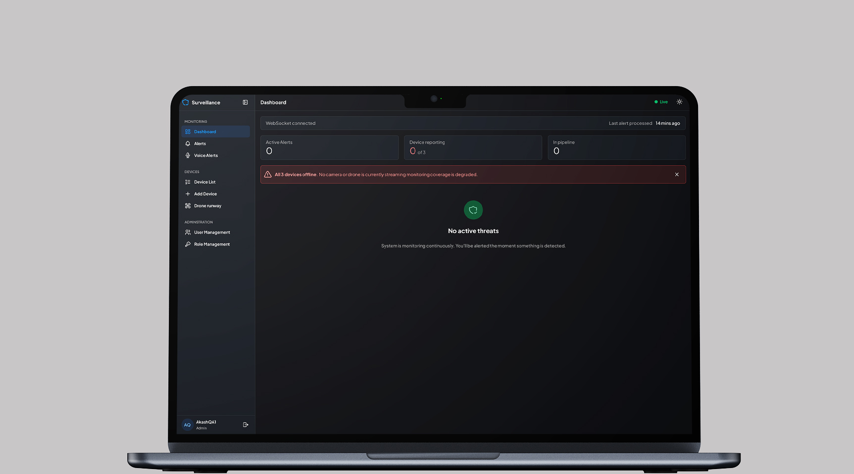
The Product
The Autonomous Surveillance Dashboard is an AI-powered enterprise security platform designed for real-time monitoring, automated threat detection, and immediate incident response coordination.
The Problem
Security operators managing high-stress environments faced severe cognitive overload due to fragmented UI components, a lack of persistent data labels, and a highly manual incident response flow. Critical seconds were lost switching between data feeds, configuring backend administrative panels, and deciding on remediation tactics.
- Findings from operator interviews and contextual inquiries
The Goal
Streamline the monitoring interface and admin configuration systems to reduce incident response time, minimize configuration errors, and introduce a cohesive multi-modal interaction system optimized for both light and dark enterprise environments.
Understanding the User
Research
We conducted qualitative user interviews and contextual inquiries with active security personnel and enterprise monitoring operators. The research revealed that operators do not just "watch video" they coordinate active responses and maintain backend system integrity under intense mental pressure.
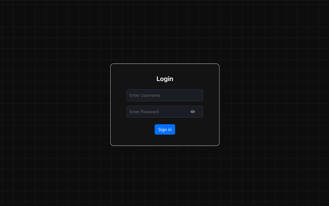
High Cognitive Load
The original platform required operators to memorize form layouts because placeholder text disappeared on input.
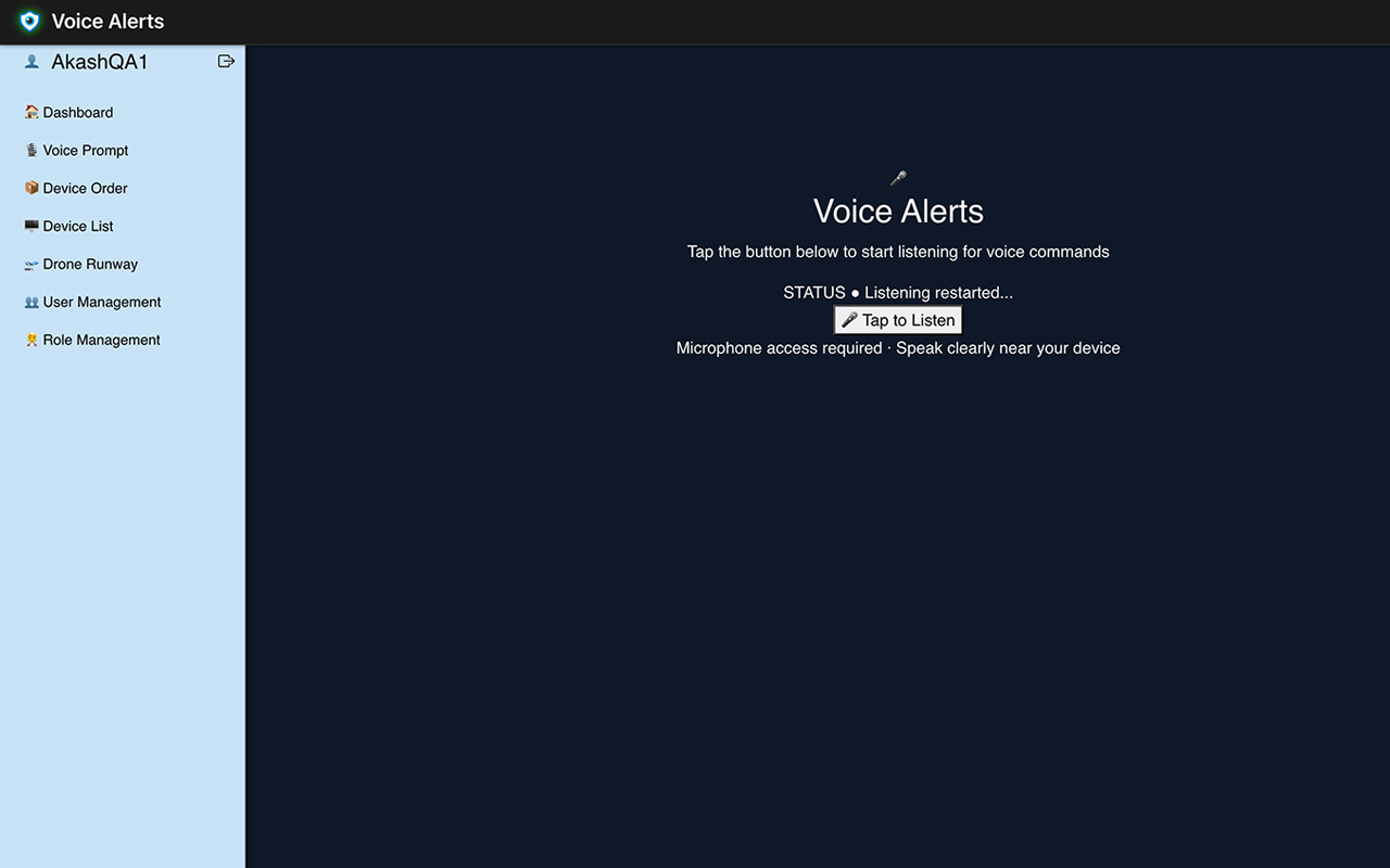
Fragmented Visuals
Extreme high-contrast sidebars and harsh grid backgrounds created visual fatigue over long 8-to-12 hour shifts.
Delayed Remediation & Passive Layouts
Operators had to manually consult external standard operating procedures (SOPs) to decide what to do during an active threat, while empty states left them completely in the dark.
Administrative Friction
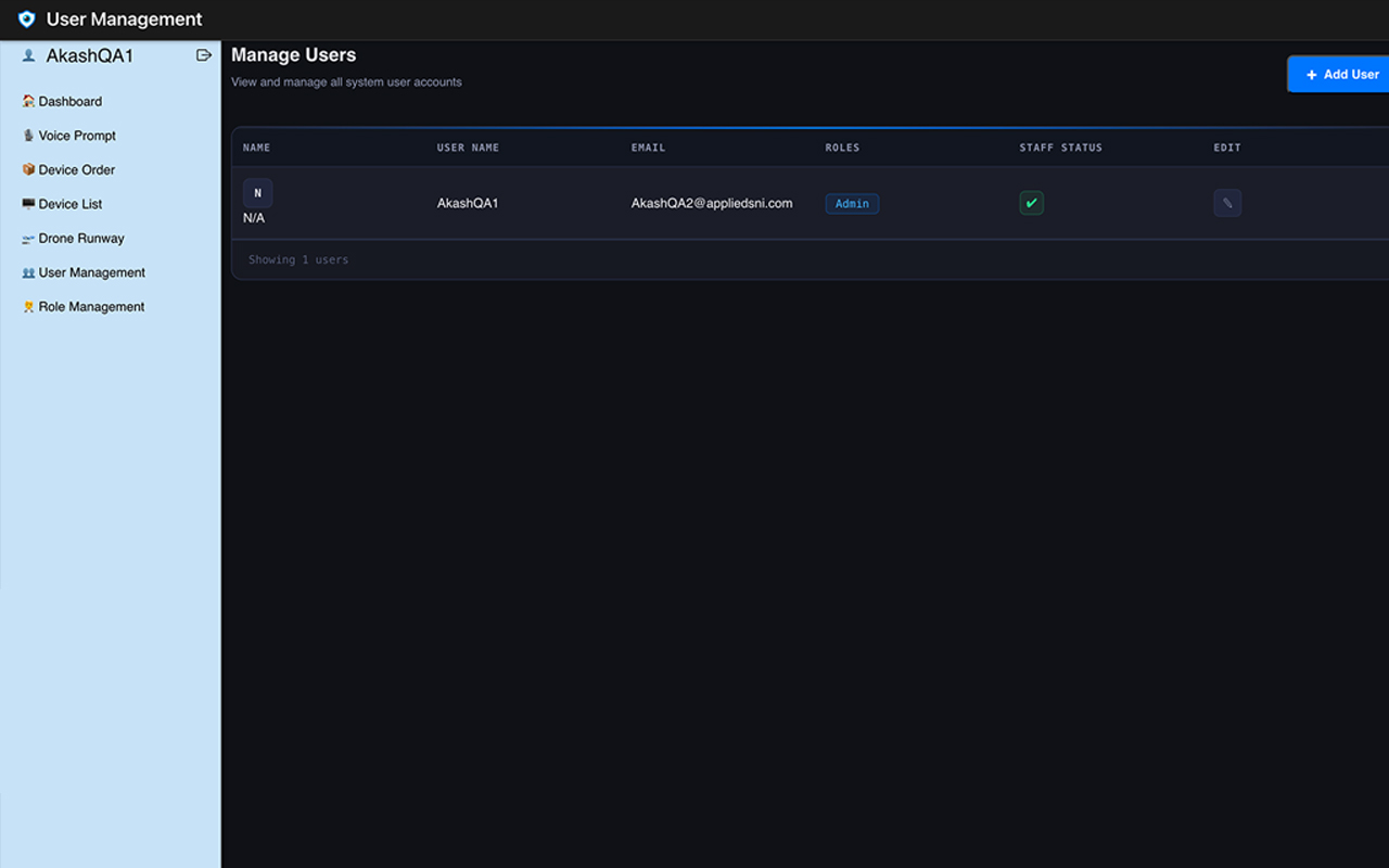
Fragmented form structures and layout proportions on data tables induced severe visual tracking strain during routine employee onboarding and permission audits.
Starting the Design
Structure
The primary navigational structure was simplified to cleanly separate immediate live-monitoring workflows from asset tracking and backend configuration systems: Login → Dashboard Hub.
-
Monitoring
- Alerts (Live View)
- Voice Alerts (Hands-free mode)
-
Devices
- Device List
- Add Device
-
Administration
- User Management
- Role Management
Refining the Design
Redesign
Guided by user feedback, we ran iterative design sprint cycles to overhaul our core workflows across the entire platform ecosystem.
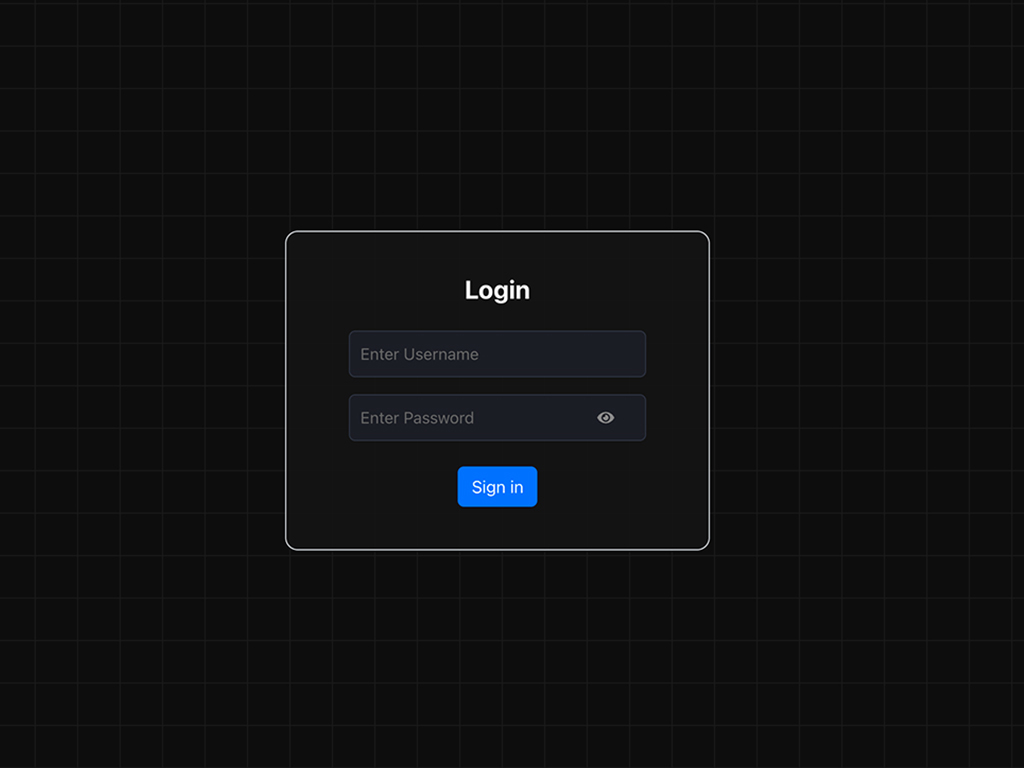
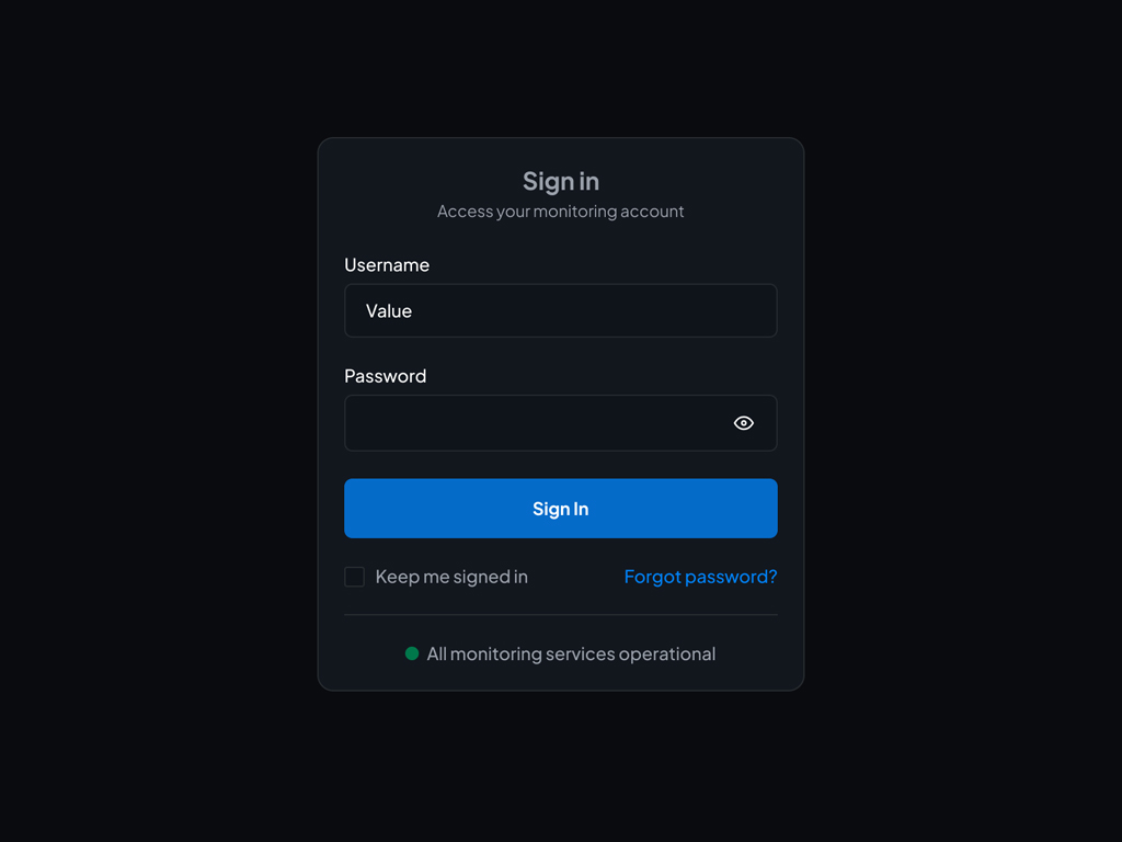
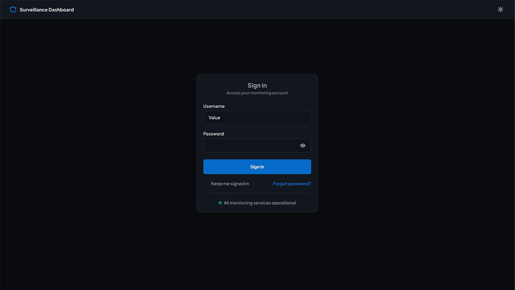
Old: Depended entirely on disappearing placeholder text within input fields.
New: Implemented persistent form labels above input fields, integrated a "Keep me signed in" checkbox, and built-in reassurance with an active system health state indicator ("All monitoring services operational").
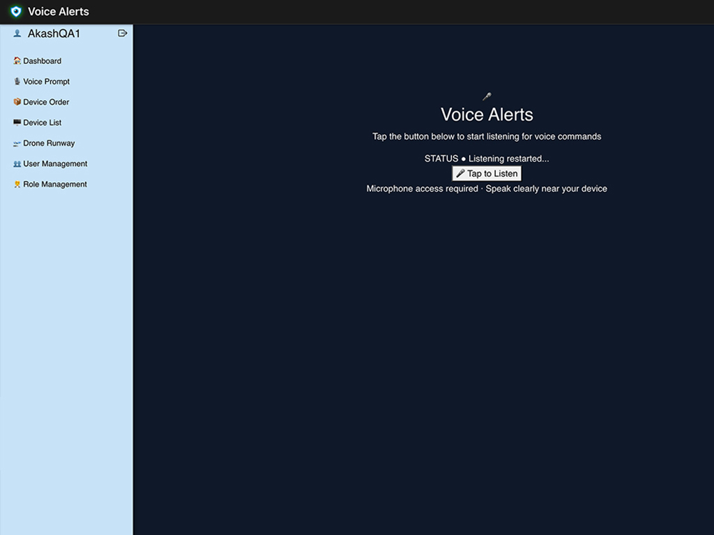
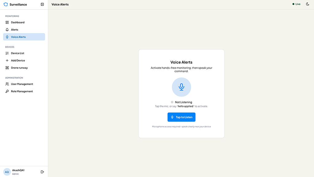
Old: Relied on an ambiguous, plain text "Tap to Listen" button with a harsh, high-contrast blue sidebar panel.
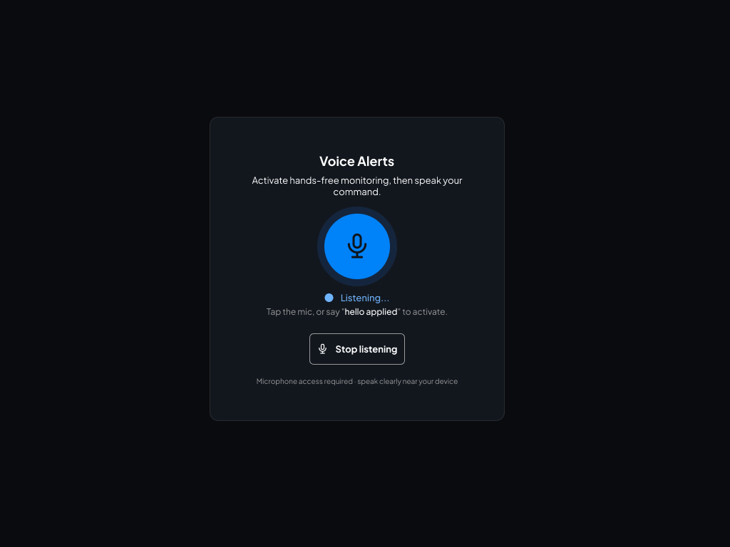
New: Introduced a clean Light Mode option to combat screen glare during day shifts, with a centralized interaction card featuring a pulsing ripple effect, a large microphone icon, and clear wake-word instructions ("hello applied").
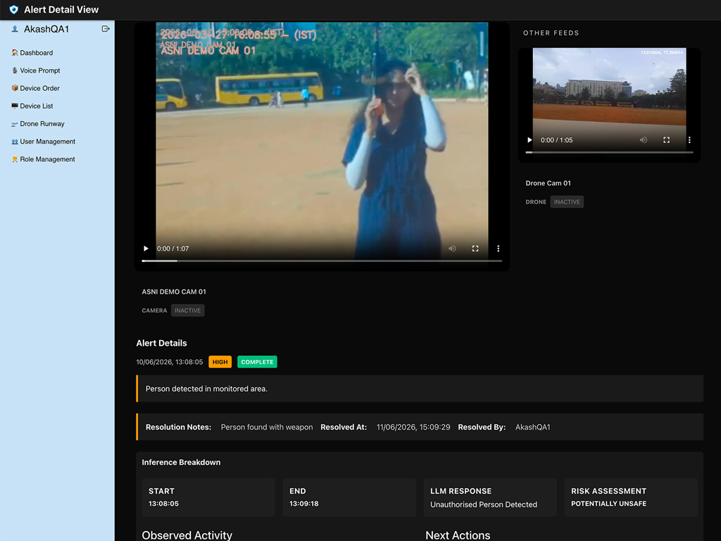
Old: Provided plain text summaries of incidents but forced operators to execute external actions to resolve them.
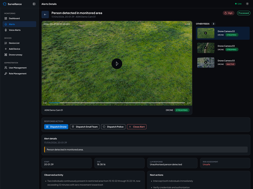
New: Embedded a dedicated Response Action tray immediately under the video viewport ("Dispatch Drone", "Dispatch Police"). This shifted the product from a passive observation screen to an active tactical operations center.
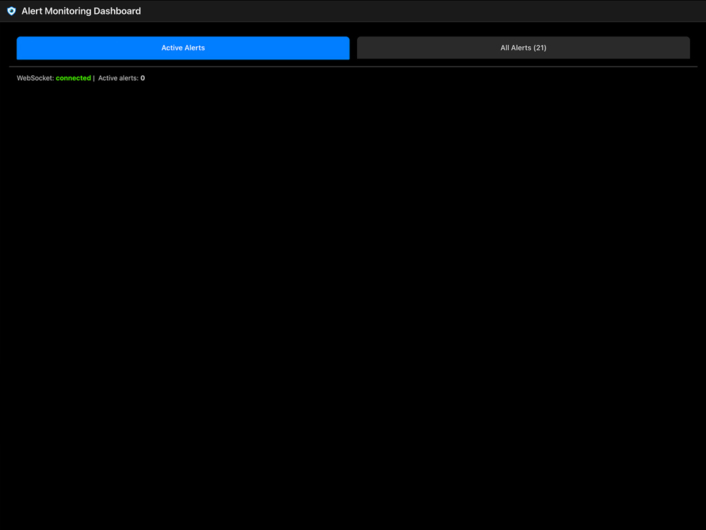
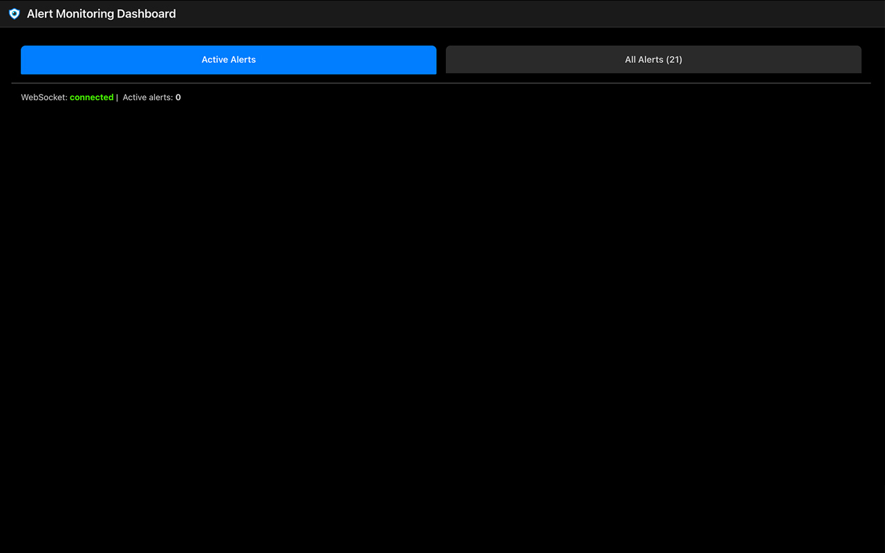
Old: Stated "Active alerts: 0" and left the entire rest of the viewport pitch black, wasting screen space on massive, clunky tab banners spanning the layout.
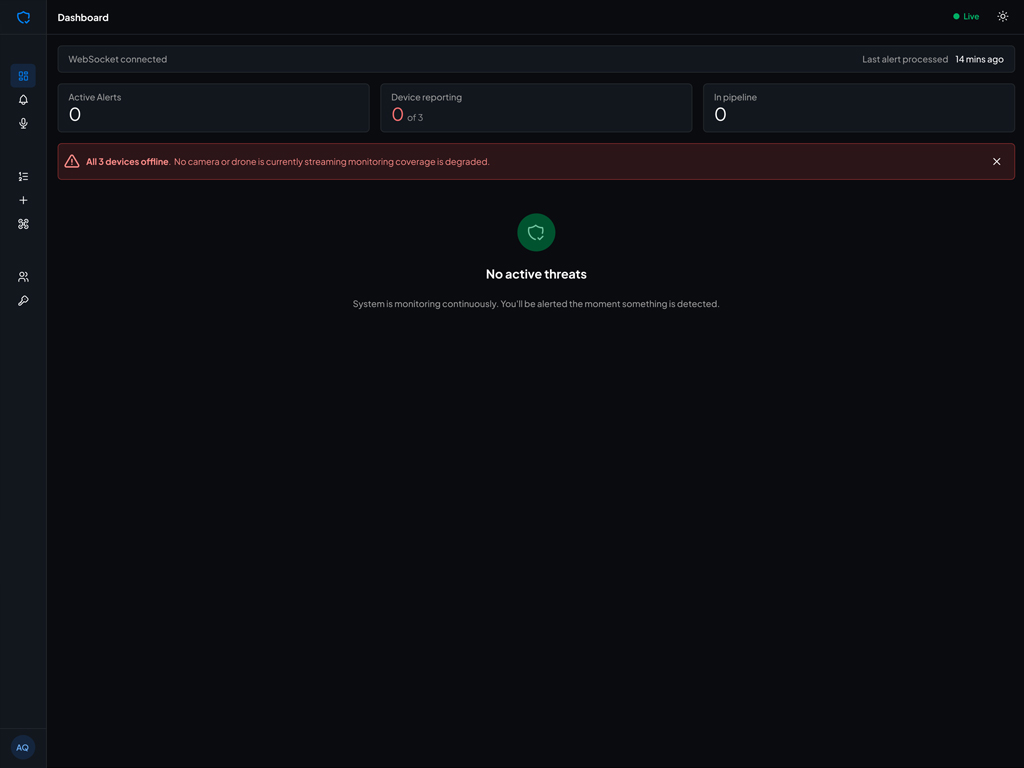
New: Removed the oversized banner buttons. Introduced a balanced tab layout and replaced the empty black layout with a proactive system log view and operational diagnostic shortcuts, maintaining spatial awareness when active alerts are down.
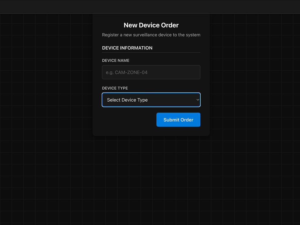
Old: Suffered from highly confusing nomenclature mixing up "Device Order" with "Register a new device," floating over a distracting, high-contrast background grid.
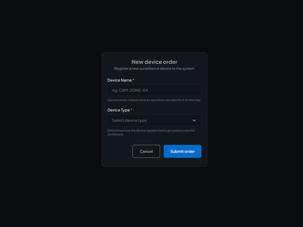
New: Separated device logistics from active system configuration. Cleaned up input cards by dropping the harsh grid lines, keeping fields anchored over a clean, minimal background with specific inline helper text outlining supported hardware types.
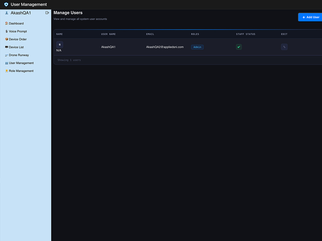
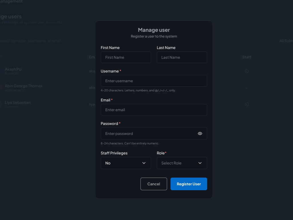
Old: The "Register User" modal featured an erratic, asymmetrical vertical form layout with blocks of plain validation text dumped directly beneath input lines, completely blinding the data table behind it.
New: Standardized the grid alignment into clean, predictable field rows. Shifted validation constraints into dynamic, on-hover indicator flags, and scaled down the overlay modal footprint to let administrators reference background data tables effortlessly.
Accessibility & Inclusivity
Designed for Every Operator
Contrast Compliance
Achieved full WCAG AAA color contrast compliance across both dark and light themes to ensure readability under intense control room lighting.
Status Signaling
Avoided using color alone to signal threat levels. Alerts feature clear textual labels alongside visual indicator badges ("High", "Unsafe", "Streaming").
Hands-Free Redundancy
The enhanced Voice Alerts module provides a seamless voice-to-text pipeline for physically impaired operators or operators juggling multiple radio channels.
Going Forward
Key Takeaways & Next Steps
Key Takeaways
- UX in high-stakes environments is about speed and clarity, not decoration. Removing visual friction and adding rapid action triggers saves critical seconds during an emergency.
- Consistency across administrative panels matters just as much as monitoring grids. Streamlining user registration and device onboarding prevents human errors that could compromise facility security protocols.
Next Steps
- Quantitative A/B Testing: Measure the reduction in Mean Time to Resolve (MTTR) with the new Response Action panel button layout.
- Haptic Integration: Explore integrating physical alert triggers (e.g., control deck hardware) to accompany the software dashboard's digital actions.
Like what you see?
Let's talk about how a clearer, faster interface could transform your team's operations.
me@abin.me