// Brand Identity
Branding Case StudyArcher: The Point of Resilience
A visual identity redesign built on the philosophy of directed focus - a mark that pierces through technical noise instead of adding to it.
Chapter 01
The World Archer Moves Through
Archer operates in Integrated Risk Management - a category where the same threat gets described three different ways depending on who's looking at it. IT sees a vulnerability. Finance sees exposure. Legal sees liability. Three departments, three vocabularies, one silo-shaped blind spot between them.
A brand mark for this world can't just look clean. It has to look like it understands the fracture it's standing in the middle of.
Chapter 02
The Tension
Enterprise risk software has a branding problem: it usually looks the way it feels to use - bureaucratic, defensive, and buried in its own technical noise. Archer needed an identity that could hold three attributes at once without any of them undercutting the others: Resilient. Precise. Premium.
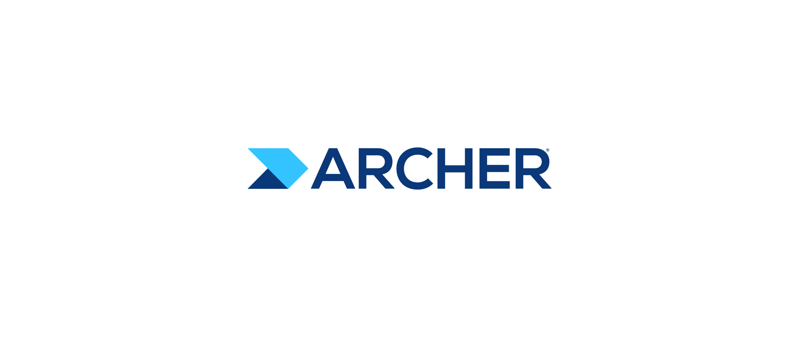
The "Archer" mark represents the human intelligence required to pierce through technical noise.
Chapter 03
The Idea: Directed Focus
The resolution came from a single philosophy: directed focus. Not a shield. Not a lock. An arrow - because the goal was never just to defend, it was to aim. By balancing a protective deep royal navy base with an innovative cyan-blue wing, the mark communicates both security and forward motion in the same gesture.
Chapter 04
Anatomy of the Mark
Every detail in the final mark had to justify its place. Here's what each piece is doing.
The Arrowhead
The geometric chevron points toward the future, signifying upward momentum and calculated risk.
Structural Integrity
A heavy sans-serif wordmark provides a foundation of stability for global enterprise clients.
Integration
The connected geometry symbolizes the unification of IT, Finance, and Legal silos.
Chapter 05
What It Carries Forward
The three silos the mark was built to unify are the same three attributes it now has to hold in the market: resilient enough to be trusted with risk, precise enough to be trusted with detail, and premium enough to be trusted with global enterprise relationships.
Need an identity with a point of view?
Happy to talk through the thinking behind Archer, or what a directed-focus approach could look like for your brand.
me@abin.me